
10 Apr Beginner’s Guide to Color Theory: How to Make Your Planner Pop

Whether you’re choosing your weekly layout colors, coordinating your stickers, or just trying to make your planner feel like you, understanding a little color theory can make a big difference. And don’t worry—you don’t need to be an artist to get the hang of it. This beginner-friendly guide breaks down the basics of the color wheel and color harmonies, then shows you how to apply that know-how to your Artful Agenda planner. Let’s dive in!
What Is Color Theory?
Color theory is a framework artists and designers use to mix, match, and contrast colors effectively. It helps you figure out what looks good together and why. Even if you’re just planning your week instead of painting a masterpiece, color theory can help your layouts feel cohesive, calming, creative—or whatever vibe you’re going for.
Meet the Color Wheel
At the heart of color theory is the color wheel, which organizes colors in a circle to show how they relate to each other.
- Primary Colors: Red, yellow, and blue. These are the OGs—every other color comes from these.
- Secondary Colors: Orange, green, and purple. These are created by mixing primary colors.
- Tertiary Colors: These are the in-between shades like teal, chartreuse, and magenta, made by mixing a primary with a neighboring secondary color.
Understanding where colors fall on the wheel helps you start combining them like a pro.
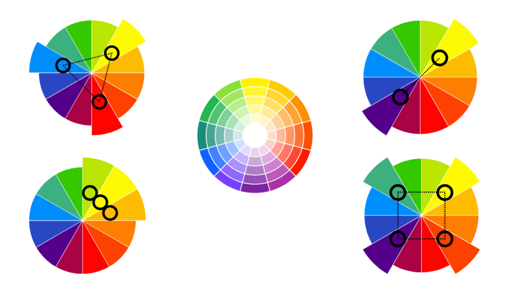
Color Harmonies: The Secret Sauce
Color harmonies are combinations of colors that naturally look great together. Here are a few you can use in your planner:
- Complementary: These are colors opposite each other on the wheel, like blue and orange or purple and yellow. This combo creates bold contrast and energy.
- Analogous: These colors sit next to each other on the wheel, like green, teal, and blue. This combo feels harmonious and soothing.
- Monochromatic: This means using one color in varying shades and tints—think navy, sky blue, and baby blue. It’s clean, calm, and classy.
- Triadic: These are evenly spaced around the wheel (like red, yellow, and blue). They offer balance and vibrancy.
- Split-Complementary: A twist on complementary—pick one base color and use the two colors next to its opposite. It gives contrast with a softer edge.
How to Use Color Theory in Your Artful Agenda
1. Choose a Weekly Color Theme
Pick a harmony and run with it! Love calm vibes? Try an analogous combo like pink, coral, and peach. Feeling bold? Complementary colors like teal and orange make your week pop with energy. Use your selected hues for event categories, calendar overlays, and notes.
2. Coordinate Stickers with Layout Colors
Our stickers are vibrant and fun—but when they match your week’s color palette, it just hits different. Using a monochromatic layout? Add stickers in the same color family to keep things cohesive. Planning a holiday week? Use a triadic palette for a festive, balanced look.
3. Personalize Your Planner Covers
Your planner cover sets the tone every time you open the app. Browse our seasonal and classic options with your favorite color harmonies in mind. Love the peaceful look of blues and greens? Choose a cover that blends those soothing tones.
4. Set the Mood
Colors influence how we feel. Use yellow to spark motivation, blue for focus, or green to feel more balanced. Got a tough week ahead? Lean into calming shades. Feeling creative? Bring on the bolds.

Don’t Overthink It—Have Fun!
The best part of using color theory in your planner is that it gives you structure without limiting your creativity. Use it as a guide, not a rulebook. And remember, it’s your Artful Agenda—if something makes you smile when you open the app, you’re doing it right.
Want to experiment with your own color harmonies? Try changing your calendar category colors for a week and see how it changes your planning mood. You might just discover a new favorite combo!
🖍️ Your Turn: What’s your go-to color combo when planning your week? Let us know in the comments or share a screenshot in our Facebook group!
✨ New to Artful Agenda? Try it out with our two-week free trial and start planning in color—no markers required!
No Comments