03 Jun Work Mode vs Home Mode – Use Calendar Color Coding to Keep Both in Balance

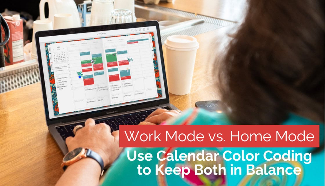
You’re managing work meetings, family activities, doctor appointments, dinner plans, and hoping to squeeze in a little downtime somewhere in between. At times, it can feel like your calendar is running you instead of the other way around. But here’s the secret sauce to staying balanced, focused, and intentional with your time: calendar color coding. It’s simple. It’s beautiful. And it’s effective. This is where the Artful in Artful Agenda shines.
Why Color Coding Works
1. Identify Your Life Categories
Start by defining the main areas of your life that show up regularly on your calendar. Common calendar event categories include:
- Work – Meetings, deadlines, projects
- Home – Chores, errands, appointments
- Family – Quality time, school events
- Self-Care – Exercise, hobbies, mental health
- Social – Events, outings, time with friends
- Planning – Brain dumps, weekly reviews, goal-setting
2. Choose Your Colors Intentionally
Pick a color palette for your calendar view that brings you joy and helps your brain process information quickly. Consider assigning calming colors to self-care, bold hues to work, and warm shades to family time. Here’s a sample:
- 💼 Work – Bold blue
- 🏡 Home/Family – Golden yellow
- 💖 Self-Care – Dusty pink
- 🧘 Wellness – Tranquil green
- 🎉 Social – Playful purple
- 📝 Planning/Goals – Gray or neutral
The key is consistency. Your brain will start to recognize and respond to your color cues naturally.
3. Use Color to Reinforce Boundaries
If your workday tends to creep into your evenings, or you find yourself folding laundry during Zoom calls, color can help you visualize (and protect) your time.
Block off your work hours in your “work color.” Reserve family time, rest, and recharge in their own designated shades. This visual separation makes it easier to shift mentally between work mode and home mode. When you see those boundaries clearly, it becomes easier to honor them.
Color coding is like the chic cousin of time blocking—related, but with better outfits. While time blocking is all about structuring your day into dedicated chunks of focus, color coding adds the visual clarity that makes that structure easier (and more enjoyable) to follow.
See Balance at a Glance
One of the best things about color coding is how quickly it reveals the bigger picture.
Too much blue? You might need to scale back work. Not enough green or pink? Your self-care may be taking a backseat.
When you see it all laid out in color, you’re empowered to adjust intentionally. That’s how you protect your peace, avoid burnout, and feel fulfilled, not just productive.
Pro Tips from Team Artful
- Customize with Hex Codes – Want even more personalization? Artful Agenda lets you use hex color codes for the perfect shades. Sites like color-hex.com or Encolorpedia can help you find the right hues to match your mood or planner aesthetic.
- Sync Smart: – Connect Artful Agenda with your Google, iCloud, or Outlook calendars so your color system stays consistent across all platforms.
- Schedule White Space – Life isn’t just about getting things done. Use a soothing color for unstructured time—moments to rest, reflect, or just be. That space is just as important as the full ones.
- Refresh Weekly – Make Sunday evening your “color check-in.” Does your calendar show too much hustle and not enough happiness? Adjust your upcoming week accordingly.
Color Coding Is More Than Pretty Planning
At its heart, calendar color coding is a mindfulness practice. It’s a way to reclaim your time, protect your peace, and live with intention.
Let your planner reflect the life you’re building—one balanced, beautiful hue at a time. 💖
Ready to See the Magic of Calendar Color Coding in Action?
Try Artful Agenda free for two weeks and discover how a visually organized planner can bring calm, clarity, and creativity to your busy life. 👉 Start Your Free Trial Today
No Comments